When you're hanging out in the wonderful world of property investing, it doesn't take long to come across the concept of the Property Clock. It's frequently used as a visual aid to show what the market is doing.
In its simplest form, it cycles from the top of the market, through a downturn to the bottom of the market, then rides the wave back up to the top of the market.
It's such a simple, easy to understand visual, appearing to cut through all the confusing data and giving a clear indication of what the market is doing.
But is it as useful to Property Developers as it appears on the surface? Or is it in reality a ticking time bomb?
First up, let's get one thing straight. I don't think the Property Clock concept is a waste of space. In fact, I sometimes use it in my own presentations to help explain certain concepts.
BUT
It's important that rather than just taking it at face value, you take the time to understand the bigger picture of what data fuels each position on the clock, and whether it's relevant to your own journey in property development.
Phases
The best place to start is by exploring the phases shown on the clock.
There's a slumping or downturn phase. This is where the market starts to drop off. You see a lot of properties sitting on the market for a long time. Vendors are trying to hold onto their prices, and those who aren't desperate for a sale will tend to take their properties off the market.
There's not a lot of buyers in the market at that point in time and the market starts to drift down. Because properties are sitting there or being delisted, sales volume tanks.
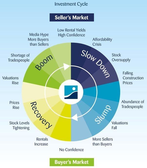 This is the phase of the clock where the hands are moving from the top to the bottom of the market.
After the market has bottomed out, there comes a point where it starts to recover. In other words, it enters the rising market phase. Now the opposite is true. Lots more buyers enter the market, drawn by the lower prices, amongst other things.
There's generally still not a lot of listings, so the pressure of more demand than supply kicks in and prices start rising. For as long as demand outstrips supply, the rise will continue, until the market gets back to a new peak and the cycle starts again.
Sounds pretty simple, right? It's easy to work out that if you follow the age old principle of buy low, sell high, you're on to a winner. In theory that's true, but in reality it's not that simple.
Data
Property Clocks are based on market indicators, which is where it starts to get more complicated. Indicators lag behind the market. They're based on telling you what has already happened. For example, number of sales is one of the main indicators that contribute to the position of the Property Clock.
Which makes sense. The issue is that sales data is often up to 3 months old. With modern technology that's sped up a little, but it's still lagging behind. Think about how fast markets can move, particularly in a boom. The fact that the data behind the clock's position is most likely a few months behind where the property market is actually operating is a problem. It's not a completely accurate evaluation of where the market is today. Relying solely on lagging indicators can lead to poor property development decisions.
Speed
This is something you may not have thought about before - how fast is the clock moving? If you don't know what drivers are operating in the property market, you have no idea how fast each phase will last.
Drivers are the factors at work in the market that cause property prices to rise and fall. In effect, they create the market. I've talked about these in more depth in other stories on Property Pulse, but here are a few to consider:
Depending on what each of these are doing, they can have a positive or negative effect on the market. So if the population is growing rapidly, there will be a demand for housing and prices will rise. If people are moving away, demand disappears and prices drop.
 What you tend to find is that a rising market takes off very, very quickly, but a declining market drops off very slowly. If you're buying for the long haul, that's probably not quite so important.
But for Property Developers, selling into a strong market is much better for your profitability. Understanding how fast the market is moving in a particular direction can be very important. To do that, you need to understand the factors sitting underneath so you can determine if "time" is travelling fast or slow. This is where understanding property market drivers gives developers an edge.
Macro vs Micro
And so we come to my biggest beef about the use of Property Clocks - they're too all-encompassing.
What do I mean by that? Well, most Property Clocks are used to talk about "the property market". Essentially they're used to cover the whole of Australia in one clock.
This is completely illogical. Australia has never been one single property market, with every area moving along in complete lockstep with every other area. In fact, it's much more common for the opposite to be true! One state will be booming at the same time another one declines.
In reality, it's not just one market for each state, either. You can break it down as far as suburb level. Then you have to consider different dwelling types. Take Melbourne, for instance. There's historically been a big difference between the market for detached dwellings (houses) and high-rise apartments.
There are certainly factors that influence property markets across the board, and understanding those drivers and how they affect your state and market is important.
But you also need to drill down to the micro level, and understand exactly what is happening to the product type you're creating, or investing in, for that area. Then you need to research the drivers that are causing that movement.
These should include, but not be limited to:
So is a Property Clock useful or a time bomb? Well, if it's based on a specific city, suburb or region, and separates out different dwelling types, it can certainly be a great way to get a quick snapshot of that particular market. But if it's a general Property Clock covering the whole of Australia? Be careful you don't take it as gospel, only to find it blows up in your face.
If you want to learn how to analyse markets beyond surface-level indicators, our free 7 Step Development FORMULA is a great place to start.
In its simplest form, it cycles from the top of the market, through a downturn to the bottom of the market, then rides the wave back up to the top of the market.
It's such a simple, easy to understand visual, appearing to cut through all the confusing data and giving a clear indication of what the market is doing.
But is it as useful to Property Developers as it appears on the surface? Or is it in reality a ticking time bomb?
First up, let's get one thing straight. I don't think the Property Clock concept is a waste of space. In fact, I sometimes use it in my own presentations to help explain certain concepts.
BUT
It's important that rather than just taking it at face value, you take the time to understand the bigger picture of what data fuels each position on the clock, and whether it's relevant to your own journey in property development.
Phases
The best place to start is by exploring the phases shown on the clock.
There's a slumping or downturn phase. This is where the market starts to drop off. You see a lot of properties sitting on the market for a long time. Vendors are trying to hold onto their prices, and those who aren't desperate for a sale will tend to take their properties off the market.
There's not a lot of buyers in the market at that point in time and the market starts to drift down. Because properties are sitting there or being delisted, sales volume tanks.
This is the phase of the clock where the hands are moving from the top to the bottom of the market.After the market has bottomed out, there comes a point where it starts to recover. In other words, it enters the rising market phase. Now the opposite is true. Lots more buyers enter the market, drawn by the lower prices, amongst other things.
There's generally still not a lot of listings, so the pressure of more demand than supply kicks in and prices start rising. For as long as demand outstrips supply, the rise will continue, until the market gets back to a new peak and the cycle starts again.
Sounds pretty simple, right? It's easy to work out that if you follow the age old principle of buy low, sell high, you're on to a winner. In theory that's true, but in reality it's not that simple.
Data
Property Clocks are based on market indicators, which is where it starts to get more complicated. Indicators lag behind the market. They're based on telling you what has already happened. For example, number of sales is one of the main indicators that contribute to the position of the Property Clock.
Which makes sense. The issue is that sales data is often up to 3 months old. With modern technology that's sped up a little, but it's still lagging behind. Think about how fast markets can move, particularly in a boom. The fact that the data behind the clock's position is most likely a few months behind where the property market is actually operating is a problem. It's not a completely accurate evaluation of where the market is today. Relying solely on lagging indicators can lead to poor property development decisions.
Speed
This is something you may not have thought about before - how fast is the clock moving? If you don't know what drivers are operating in the property market, you have no idea how fast each phase will last.
Drivers are the factors at work in the market that cause property prices to rise and fall. In effect, they create the market. I've talked about these in more depth in other stories on Property Pulse, but here are a few to consider:
- population growth or decline
- supply and demand
- purchasing power
- new infrastructure
- demographics
- unemployment rates
Depending on what each of these are doing, they can have a positive or negative effect on the market. So if the population is growing rapidly, there will be a demand for housing and prices will rise. If people are moving away, demand disappears and prices drop.
What you tend to find is that a rising market takes off very, very quickly, but a declining market drops off very slowly. If you're buying for the long haul, that's probably not quite so important.But for Property Developers, selling into a strong market is much better for your profitability. Understanding how fast the market is moving in a particular direction can be very important. To do that, you need to understand the factors sitting underneath so you can determine if "time" is travelling fast or slow. This is where understanding property market drivers gives developers an edge.
Macro vs Micro
And so we come to my biggest beef about the use of Property Clocks - they're too all-encompassing.
What do I mean by that? Well, most Property Clocks are used to talk about "the property market". Essentially they're used to cover the whole of Australia in one clock.
This is completely illogical. Australia has never been one single property market, with every area moving along in complete lockstep with every other area. In fact, it's much more common for the opposite to be true! One state will be booming at the same time another one declines.
In reality, it's not just one market for each state, either. You can break it down as far as suburb level. Then you have to consider different dwelling types. Take Melbourne, for instance. There's historically been a big difference between the market for detached dwellings (houses) and high-rise apartments.
There are certainly factors that influence property markets across the board, and understanding those drivers and how they affect your state and market is important.
But you also need to drill down to the micro level, and understand exactly what is happening to the product type you're creating, or investing in, for that area. Then you need to research the drivers that are causing that movement.
These should include, but not be limited to:
- infrastructure being built
- vacancy
- dwellings types
- affordability of the product
- demographics
- sales rates
So is a Property Clock useful or a time bomb? Well, if it's based on a specific city, suburb or region, and separates out different dwelling types, it can certainly be a great way to get a quick snapshot of that particular market. But if it's a general Property Clock covering the whole of Australia? Be careful you don't take it as gospel, only to find it blows up in your face.
If you want to learn how to analyse markets beyond surface-level indicators, our free 7 Step Development FORMULA is a great place to start.